TJIIRRS: Number 20
Red Temmoku: A Difficult Glaze
(started 2010.0712)
Preliminary note: when most people talk about “red
temmoku”, they are referring to a glaze that is
orange or orangy-brown or, at best, an orangy-tomato
color. That isn’t at all what I’m talking
about here.
When I first started making my own glazes, I read Robert Tichane’s book about Ash Glazes. In his discussion of Jian teaware he mentions having been given a chip of glaze, and (assuming I remember this correctly) he says that in transmission it was a brownish yellow color. Jian teaware, however, looks almost black. This is because the bowls are made of a dark stoneware-type clay, and a brownish yellow glaze looks really dark on them; I am using porcelain, and a glaze of that sort is not anywhere near as interesting, at least to me.
The Metropolitan Museum of Art, in NYC, has a photo of a particularly lovely “Hare’s Fur” piece on its Website. As you can see, aside from the crystalline formations that give it the appearance of fur, the glaze appears quite dark.
I decided that what would really suit me would be a glaze that fired out to a deep cherry/mahogany red. On porcelain, such a thing would be lovely.
My first attempt at mixing such a glaze was successful, but as soon as I tried it again, I failed. This taught me two important lessons: you have to sift the clay and the ashes before you weigh them out, because otherwise you don’t know the actual proportions of the glaze. It also helps to keep a searchable record, and very soon after that I started using glaze calculation programs. (I am currently using Tony Hansen’s Insight; but what works for one person is not necessarily optimal for another, so if you are a potter and you are looking for a good glazecalc application, you should definitely try several before you settle on one.)
I fussed and fretted for a long time, firing glaze test after glaze test. I got some very striking things, but nothing I could really call red. True, there were bits of redness here and there on occasional tiles, but not enough to give me a working glaze.
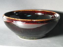
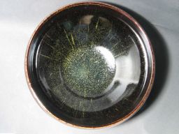
In 2004, after another round of testing, I finally achieved something viable. It looked about like this:
When the level in the bucket started to get a bit low I added more glaze, and the next thing I dipped in it fired out brown instead of red. I have been searching for the key to this for several years now, and every time I think I have it, I get another brown or opaque glaze test out of the kiln. This is discouraging and tiresome, but I have certainly narrowed down the parameters to some extent. I keep going for two reasons: first, the fact that I really want this color. Second, the fact that every once in a while I get a hint of it on a piece or a test tile. The issue seems to be that it is tweaky, and that the key parameters (whatever they turn out to be) must be within a fairly narrow range of values.
I initially thought that the particular type of Red Iron Oxide was the key, or at least one of the keys; but I have since seen some red on pieces that used ordinary synthetic high-purity RIO.
I initially thought that a hot reduction firing was key, but I have some test tiles with red on them that were fired at cone 9 in the electric kiln, and I have seen some red on at least one piece that I fired to cone 9o.
It occurred to me that a slow cooldown might be important, but I have at least one test tile that was fired in my little test kiln, which is incredibly fast, and must have cooled in 4 hours or so.
Recently I have been digging back through glaze recipes and my notes on them, and I have discovered an odd thing: the percentage of brick clay that I use in the glaze has crept up stealthily over the years. As far as I can tell, the original was only about 40% clay, whereas many of my recent tests have been above 70%. This would seem to be a key, ...except that the glaze on the bowl in the photos above seems to have been made with about 70% clay. Go figure.
I continue to be puzzled, and I continue to test various conjectures. My last few tests have been more like a Kaki (“Persimmon”) glaze — rich crystalline brown, rather like the inside of a ‘Hyakume’ or ‘Chocolate’ persimmon, and quite opaque, so my next step will probably be to revert to a 50-50 mix of clay and ash, which should be pale green and transparent, and start adding iron oxide to see what happens to the color.
Wood Ash being the highly variable material that it is, however, this means not one series of tests but rather at least 4. I have ash from a wood-fired pizza place, from Dr. Becca Levin’s fireplace, from a charcoal grill, and from a Black Locust tree that Edwin Gould collected. (I also have smaller quantities of ash from several sources including Fred Paget, and if I can’t get enough information from the four I list above, I can always try some of the others. The problem is that I want to mix a lot of the glaze, so I need a fair amount of ash; I am fervently hoping that the composition of the ash is not crucial.)
There is, of course, the obvious possibility that there are several keys, all of which must be in place in order for the red color to appear. It might help if I had analyses of all of my materials, so that I could get a better sense from the glaze calculation program (which I am currently using mostly just as a recipes-and-notes archive), but analyses are expensive, so at least for now I am proceeding on a grossly empirical basis. Eventually, however, I may have to grit my teeth and start saving for a battery of XRF runs. (I do have XRF analyses of the brick clay, performed by Mary Simmons some years ago, and they are extremely helpful; but without analyses of the ashes I am still to a large extent floating around like an untethered balloon.)
(More as it transpires...)
the Joss Research Institute
19 Main Street
Laurel MD 20707-4303 USA
Contact Information:
My email address is a@b.com, where a is my first name (just jon, only 3 letters, no “h”), and b is joss.
My phone number is +1 240 604 4495.
Last modified: Thu Jun 23 16:05:34 CDT 2016

